The world is changing incredibly fast, and people quickly adapt to new things. Life is all about movement and dynamism, so it’s essential, especially for designers, to stay on trend and evolve as the world changes. Think back to how bank websites looked 10 years ago. Remember that strange design that now seems inconvenient and unattractive? Yet back then, 10 years ago, that design was considered unique and fresh.
People quickly get used to things—that’s how our brains work—and we love seeing something new. But design isn’t just about how something looks. Steve Jobs once said, “Design is not just what it looks like and feels like.” Today, good design is defined not only by appearance but also by how it interacts with the user. And industries like Fintech are no exception.
In this article, we want to share our experience and insights on what it takes to create a new design for an existing or new fintech website.
Finding Inspiration for Your Design
We believe that every project should start with inspiration. However, it’s important not to limit yourself to other Fintech websites for ideas. While analyzing competitors is essential—understanding their color schemes, site structure, and useful features—this should come after you’ve developed a concept. Your concept shouldn’t be a copy of something else; it should be your original creation. You need inspiration to create a unique design.
Where Can You Find Inspiration for a Fintech Website?
Inspiration can come from anywhere until you find something that truly aligns with the theme of a fintech website. And of course, if you’re designing for a client rather than yourself, it’s a good idea to find a few concepts and pitch them. Whether it’s painting, music, movies, or architecture, the list of potential sources is endless. Some designs even come to life after scrolling through Instagram or TikTok. But remember, we’re inspired by things—we don’t copy them. It’s frustrating to see bank or insurance company websites that look like carbon copies of each other, just mimicking one another’s structure.
This step should lead to a concept for your project. It’s not the final design but a vision of the style and potential functionality.
Competitor Analysis and Improving Your Concept
Now comes the part every designer loves—analyzing the competition to adopt the best practices from successful fintech websites. Identify your competitors’ strengths and weaknesses. It’s particularly useful to read negative feedback from their users. Also, consider using a competitor’s site yourself to evaluate its design.
Once you’ve solidified your concept and analyzed competitors, you’re ready to start developing your fintech website. Now, we’ll share some principles we’ve learned—sometimes through mistakes, sometimes through success.
Key Principles for Designing the Perfect Fintech Website

Simplicity Is Key
No one likes a complex website that takes effort to navigate, especially in the financial sector, where users highly value their time. They don’t want to deal with intricate menus, animations, or convoluted site structures. Put yourself in the user’s shoes: What pages do they want to see first? What should be highlighted, and what’s less important? What information should they know right away? Simplicity makes for a pleasant user experience.
Be Honest with Your Users
Your design should be not only beautiful but also transparent. Don’t hide anything from the user. For example, avoid using timers that falsely claim a discount is only available for the next 30 minutes, only to reset after time expires. No one likes being deceived. A satisfied user will bring one or two more users, but a dissatisfied one can drive away many. Avoid misleading tactics like fake timers, pop-ups, or banners.
Add Features That Enhance User Experience
If your fintech website caters to users from different countries or supports multiple currencies, consider adding automatic currency conversion or an interactive sidebar where users can easily convert currencies. Think about what you would like to have as a user, or better yet, conduct a survey to find out.
Don’t Copy Competitors
Plagiarism is detrimental, both to the user and to you. It’s easy to copy something that works, but there are no simple solutions to complex problems. Copying stunts your growth as a professional and doesn’t contribute anything new to the world. Copies rarely achieve success.
Keep Symmetry And Commonly Accepted Standards In Mind
Certain elements, like symmetry, an appropriate color palette, and easily readable fonts, should remain consistent. If links in your text aren’t distinguishable from the rest of the text, that’s a problem. It might sound boring, but there are some established norms everyone is used to, and if you don’t follow them, some users might not understand your design. Include breadcrumbs in your design, ensure the logo links back to the homepage, and make sure your site has contact information, a privacy policy page, and a well-designed 404 error page. By the way, there are even entire websites and Reddit threads dedicated to showcasing different 404 error page designs.
Hire a Professional
If you’re a designer and you’re facing difficulties with a project, there’s nothing wrong with seeking support from colleagues or hiring a more experienced designer who can either share their expertise or even assist with your project.
If you’re not a designer working on a client project but rather someone handling a personal project—which, with the development of technologies like AI, is becoming an increasingly simple task—again, don’t hesitate to hire a designer or an agency that specializes in developing and designing fintech websites.
Don’t Be Afraid to Innovate
Design has always been about innovation and bringing something new to the table. Your idea might set a new trend. Don’t be afraid to make mistakes; some ideas will work, some won’t, but you’ll never know unless you try.
Test Everything
Test all your innovations, even those that have worked well before. Test features that have never worked well. Test it yourself, or ask someone unfamiliar with your website to test it. A good chef tastes the dish at every stage of cooking to ensure everything is going according to plan.
Don’t Forget the Technical Side
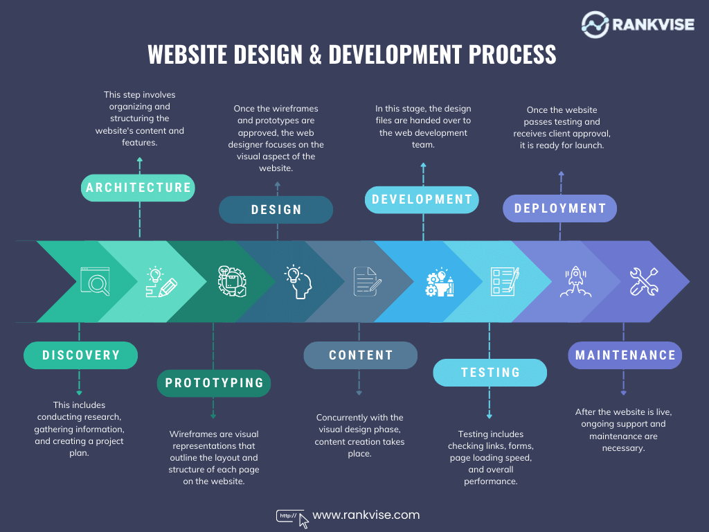
Designing a good website is just the beginning; someone has to develop it and make it function properly. From a design standpoint, a video on the “About Us” page featuring each employee might seem like a good idea, but consider how quickly such a page will load. Will everyone want to download the video to learn about your team? Sometimes, a few lines of text can be more effective and improve site speed.
Remember, developers and SEO specialists may have critical input that should be considered during the design phase. This ensures that your design is not only implementable but also optimized for search engines, so it reaches the widest audience possible.
Design For The Mobile Version First
The future is in mobile, and that’s a fact no one can argue with. Even Google implemented a “mobile-first” algorithm back in 2019. Since then, this algorithm primarily crawls the mobile version of a website for indexing, only checking the desktop version if necessary. These days, the ratio of users accessing a site on mobile devices is often about the same as those on desktops, but that number continues to grow each year. So, make sure that the mobile version looks good both from a design and technical perspective. Everything should load quickly, and all content should display correctly.
Design with the Goal of Conversion
At the end of the day, the goal of your project is to create a design that meets users’ needs and ultimately leads to them purchasing a product or becoming a client. While we all want to prioritize aesthetics, ask yourself: Would you want to buy a service or product on this site? Was the site convenient for you to use?
Typically, a Fintech website is one where users spend a lot of time. It’s not like a dog food store where you make a quick purchase and leave. As we mentioned earlier, your client is usually someone who values their time highly, and any design obstacles could negatively impact your conversion rate.
Conclusion
Website design is not static—it becomes outdated, and some decisions may not be successful. On the other hand, some random decisions can lead to unexpected positive results. Always be open to learning from mistakes and listen to criticism from others, no matter who it comes from.
To sum up, design is not just the visual appearance of a website; it’s a well-oiled machine that needs to function smoothly. Sometimes a design no longer meets user needs, and sometimes it doesn’t follow current trends. Website design is neither permanent nor simple. Some design solutions might be ahead of their time. To create a successful Fintech website, you need more than just professional skills—you need inspiration, a deep understanding of your audience, and determination. Remember, there are no simple solutions to complex creative challenges.

