Skip to content
The genuine responsiveness of your website design goes beyond just adapting to different devices. It also involves ensuring that the typography adjusts for optimal readability. Responsive typography entails adjusting text elements to change the size and scale of websites. However, it’s not merely a technical matter; there’s an equally crucial aspect of custom WordPress website design because simply altering the size of a text element may not suffice. Our Responsive Web Design Font Size Guidelines will explore the basics and how to find the correct scale of fonts.
Responsive Typography Design Basics
A robust, responsive typography plan ensures your content remains legible across various devices. It involves establishing guidelines for interaction, size, and scale to facilitate consistent rendering across different screens. For most websites, the focus typically revolves around two main sizes: desktop and mobile. In recent years, tablet usage for general web browsing has significantly decreased.
It’s essential to recognize that a font and scale that appear appealing on a wide screen may not translate well on a vertically oriented handheld screen. This factor influences font selection and website planning; switching typefaces between desktop and mobile is generally discouraged.
During the design phase, integrating typographic elements within the overall framework is crucial to avoid unexpected challenges with responsive typography later on. For instance, super wide fonts can pose unique readability issues on mobile screens.
Considerations for responsive typography design encompass several key aspects:
- Begin with a font suitable for small screens before testing it on larger ones.
- Managing a smaller palette reduces complexity and minimizes load times.
- If your preferred font fails to load or isn’t supported by specific devices or servers, having an alternate common choice, such as Arial, can be beneficial.
- The readability of typography depends not only on font selection but also varies based upon other content elements displayed simultaneously.
- Adding extra space between lines can enhance readability specifically for mobile devices while striking an optimal balance is crucial; starting with 150% or 1.5em line heights could be advantageous for smaller text sizes.
- Using diverse font variations like serifs or experimental types has become commonplace among designers; however, these choices may present challenges when viewed in dark mode primarily used by users – early testing ensures readability if opting for this route.
Understanding Responsive Type Sizing
When developing types for responsive designs, careful consideration of sizing and scale is crucial. Different designers may have varying preferences regarding the type of size unit they wish to utilize.
The commonly used size units are:
- Pixels: Typically used for digital font size, representing an absolute number.
- Points: More associated with print design and less prevalent online.
- Ems: Sizing relative to the parent font size.
- Rems: Sizing that inherits root styling.
- Percentage: Size based on a percentage change from a parent style.
Many designers opt for percentages or ems and rems instead of absolute numerical units as it offers flexibility in adjusting sizes based on a base measurement such as body text.
This approach simplifies calculations (e.g., 1rem is approximately equal to 10px) and facilitates comprehensive adjustments by altering the default font size.
For instance, typical body text ranges from 16px to 18px or 1.6rem to 1.8 rem (14px to 16px for mobile). Once this base is established, you can proportionally adjust all other elements according to your preferred scale.
By setting appropriate sizes for desktop and mobile body texts or default fonts, the scaling will seamlessly adapt other elements in your design accordingly.

How to Find the Right Scale for Responsive Typography
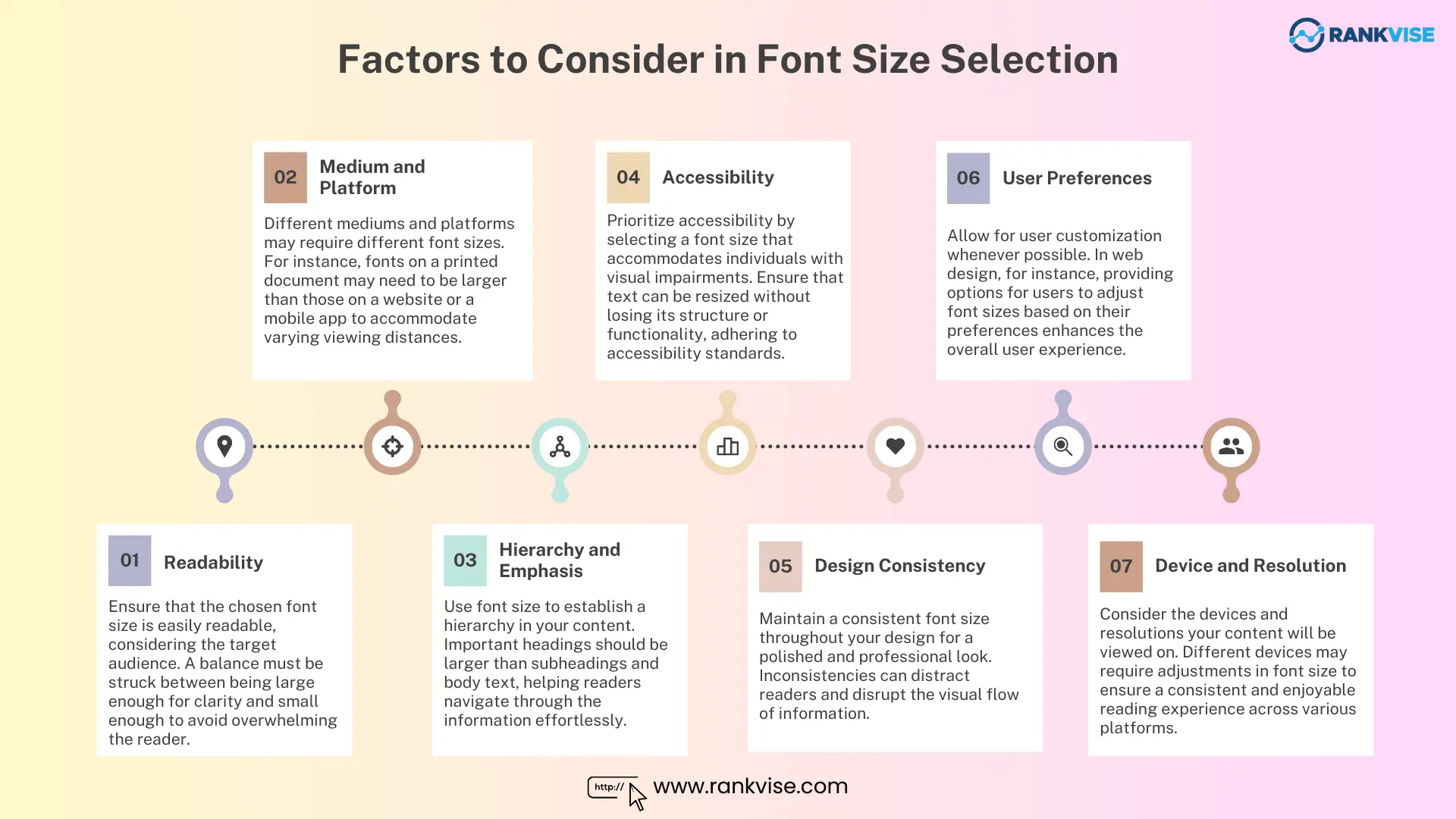
When choosing the correct scale for responsive typography, there are several essential factors to consider:
- Typography Selection: Begin by selecting a font that looks great and is easy to read on smaller screens before testing it on larger screens.
- Limit Type Options: Managing a smaller palette of type options can make the process easier and reduce load times.
- Fallback Option: In case your desired font fails to load, have an alternate selection in mind that is widely supported, such as Arial for sans serif typefaces.
- Design Size and Scale Based on Content: The readability of typography depends not only on the font choice but also on other content elements.
- Line-Height: Adding extra space between lines can improve readability on mobile devices, but finding the right balance is crucial – around 150% or 1.5em line height could be a good starting point for smaller sizes.
- Font Category: Designers increasingly embrace various font categories like serifs and experimental fonts as their standard practice.
- Type Scale: The type scale determines how much bigger or smaller fonts become relative to the base or default font size – typically using percentages or em units.
Remember, responsive typography ensures your content remains readable across different devices by establishing interaction, size, and scale rules.

Conclusion
In web projects, typography design holds significant importance. Considering the rendering and readability of text at different sizes is crucial for creating valuable and accessible web experiences. A strong typographic foundation and the ability to adapt to various website viewers are essential factors in this process.