Skip to content
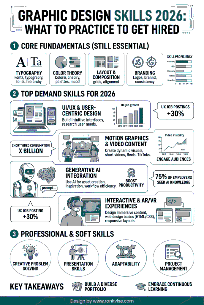
You can feel the shift the moment you open a job post. “Graphic designer” used to mean dealing with posters, logos, or maybe a few social tiles. In 2026, you have to grasp brand systems, micro-content, UI handoffs, and AI-assisted drafts. You have to make a million tiny decisions that either look effortless or look… homemade.
- Treat design as reliable output under constraints: follow deadlines, brand rules, and device and accessibility requirements.
- Master production fundamentals: consistent grids, readable typography, color contrast, proper exports, and clean handoffs.
- Design for context: adapt one piece across channels to match audience behavior and platform quirks.
- Build a feedback workflow: translate vague comments into goals and explain design intent to reduce rounds.
- Showproof in your portfolio: focused case studies, mini brand kit, before/after, and ready-to-use handoff files.
I noticed this in the weirdest way: I was reading an essay writing service review by NoCramming and caught myself scanning it like a designer. Headings first. Then, spacing. Then, whether the page felt easy to move through.
You don’t need more trendy tricks if you want to stay competitive this year. You need fewer weak links in your workflow.
Let’s talk about what’s worth practicing so that your effort matches what hiring managers look for.
Start with the definition employers use
When people say “design,” they often mean “taste.” When employers say “design,” they mean “reliable output under constraints.” They want to be sure you can follow deadlines, remember brand rules, pay attention to device sizes, accessibility, file formats, stakeholder feedback, version history… Yes, that is by no means glamorous.
So, when you work on graphic design skills, treat them like a system you can run on a Tuesday at 6 p.m. when Slack is on fire.
Here’s a reality check to try: can you take one messy request and turn it into something shippable without needing ten rounds of clarification? That’s the job.
And here’s what to practice: take any random brief and write down the constraints before you design anything. You’ll be surprised how much calmer your work gets when you decide the box first.
Get your production fundamentals sharp
You can have great ideas and still lose opportunities because your files are chaotic. Production discipline reads like professionalism, even when nobody says it out loud.
This is where graphic design hard skills save you. Stick with the set of fundamentals this year:
- Layout: consistent grids, alignment you can explain, spacing that feels intentional
- Typography: pairing, hierarchy, line length, and readable body text on mobile
- Color: contrast checks, predictable palettes, and consistency across formats
- Exporting: correct sizes, compression without mush, proper file naming
- Handoff: clean layers, components, and notes that keep devs from guessing
Typography deserves its own mini-obsession because it shows up everywhere. If your type choices fall apart on different screens, people feel it instantly, even if they can’t name it.
Also, tools matter, but only if you can be confident using them. When speed is the priority, keep a short list of Canva alternatives for different kinds of work.
Learn to design for context
Many skilled designers get stuck because they design for aesthetics first. But in 2026, teams want designers who understand what the piece is supposed to do.
This is where skills for graphic design turn into design judgment. You’re making choices based on audience behavior, platform quirks, stakeholder guidelines, and a realistic brand promise.
For example, a carousel that looks well on a portfolio grid can be a mess on Instagram if the type is too small, the pacing is wrong, or the first slide has no hook. Different context means different results.
To practice, take one piece and adapt it for four channels:
- Instagram carousel
- LinkedIn single image
- Email header
- Landing page section
You’ll learn more from that exercise than from making ten unrelated posters.
Build a feedback workflow that doesn’t crush you
Design is collaborative now, even when you freelance. You’ll get comments from marketing, product, sales, founders, and sometimes a person who just discovered the word “pop.”
If your workflow can’t absorb feedback, you burn out. If you absorb everything, the work turns bland.
So, your job is to translate feedback into a decision. What are they really worried about? Is it clarity, credibility, brand risk, conversion, or personal taste?
When you get vague feedback (that will likely happen to you), ask for the goal. “What should the viewer do after seeing this?” gets you better answers than “What don’t you like?”
Feedback also gets easier when you can explain what the visual is trying to do. Communicating design intent is a useful language to borrow in such a case.
Have ready examples that show a range of your skills
Portfolios fail in two ways. They are either a pile of unrelated pretty things, or they are so samey that nobody believes you can adapt.
You want a range with a thread running through it. If you’re collecting graphic design skills examples, pick pieces that show different muscles, not different aesthetics.
Here are the examples that signal “I can work in your team.”
- A mini brand kit: logo usage, colors, type scale, and social templates
- A landing page hero section with a clear hierarchy and CTA
- A before/after redesign showing what you changed and why
- A campaign set: ad, email header, social post, and a simple one-page PDF
- A data visual: chart choices, labels, readability, and source note
Notice how each example is tied to an outcome. That’s what hiring managers scan for.
Treat job requirements like something you should prove
Job posts love vague phrases: “strong communication,” “attention to detail,” “good taste,” “team player.” You can’t paste those into your portfolio and call it a day, though.
Translate them into proof.
When you see graphic design requirements skills, your move is to build artifacts that demonstrate them. For example:
- “Attention to detail” becomes clean spacing, consistent type styles, and error-free exports
- “Communication” becomes a short case study that explains your choices in plain language
- “Collaboration” becomes a handoff file that a dev could use without asking ten questions
This is also where file hygiene matters. Naming, version control, and clear structure look boring until you work with someone who doesn’t have them. Then you feel the difference in your bones.
Answer the question hiring managers are silently asking
They really want to know: can you do the job they need, with the tools and constraints they have?
Pay attention to these daily-use skills to become a competitive candidate:
- Visual hierarchy that makes scanning easy
- Typography that survives mobile screens and weird content lengths
- Brand consistency across batches of assets
- Speed without sloppiness
- Comfort with feedback and iteration
One underrated detail: speed is not rushing. Speed is reducing backtracking. Templates, components, saved styles, and clear briefs are how you get faster without quality falling off a cliff.
Build a simple improvement plan that you can stick to
Talent is cute, but consistency gets you hired and kept anyway.
If you’re figuring out how to improve graphic design skills, stick with a plan you can run even when you’re exhausted.
Let’s say you’re planning to work on your skills during the next 4 weeks. Here’s how you can approach it.
- Week 1: typography drills (type scale, spacing, and hierarchy on real content)
- Week 2: layout drills (grids, alignment, responsive variations)
- Week 3: brand consistency (one kit and ten assets)
- Week 4: portfolio polish (case studies, before/after, and a refined presentation)
Wrap each week with one deliverable you can show: a carousel, a landing section, a mini brand kit – you name it.
Also, steal constraints from real life. Make a mock “launch announcement” where the product name is long and the deadline is tomorrow. This way, you’ll reveal your weaknesses and will be able to mitigate them.
Know what to lean on AI for
AI can speed up rough drafts, concept exploration, background removal, resizing, and variant generation. While that’s useful, by overrelying on AI, you’re at risk of looking average.
The designers who stand out in 2026 only use AI as a shortcut for production. They still choose the hierarchy. They still decide what matters. They still notice when something feels off.
Your edge is not “I can generate options.” Your edge is “I can pick the right option, refine it, and ship it in the brand system.”
Test yourself: if someone removed your name from the file, would your work still look like it belongs to a specific brand, made by a careful person? That’s the standard now.
Let’s wrap it up
So, what skills are needed for graphic design in 2026? This year, everything is more about becoming dependable. You should be able to offer a logical hierarchy, readable type, consistent systems, and files that other people can work with. That’s what makes teams trust you with bigger projects.
To grow as fast as possible, practice inside constraints, under real deadlines, and be open to honest feedback. Build a small set of portfolio pieces that prove you can handle production and judgment, not only style.
The good news is that this is learnable. So, pick one skill, drill it, ship the result, and repeat next week. Then, get used to saying why you did what you did under time pressure and strict guidelines. When you can do that, that’s what hiring managers notice first, even when they don’t say it out loud.