Skip to content
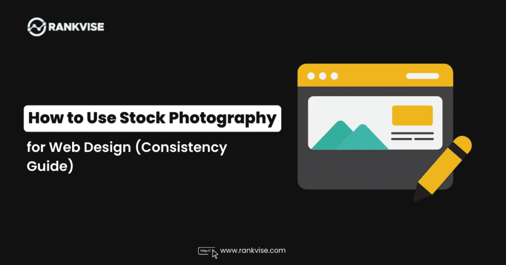
A website can have flawless code, beautiful typography, and enough white space to make a minimalist weep with joy, yet still feel… off. The usual culprit isn’t the layout or the copy. It’s the visuals. When images clash in tone, color, and mood, the site starts to look like it was assembled from three different planets by a committee of well-meaning aliens. Consistency is what turns “a bunch of pages” into a brand experience.
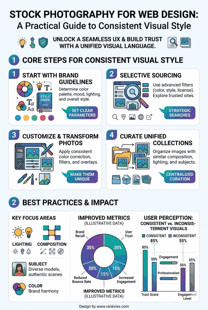
- Start with a one-page photo style brief and pick a primary photography mode to guide consistent image choices across the site.
- Audit existing visuals, build a curated image library, and assign on-brand photos to placements so images read as a unified set.
- Standardize crops, color and editing recipes, align imagery with UI, and run a quick consistency checklist before publishing.
Stock photography is one of the fastest ways to level up a web design, but it’s also one of the fastest ways to accidentally create a visual identity that resembles a thrift store rack: lots of interesting pieces, nothing that matches. This guide is a practical workflow for choosing and using stock imagery so your site looks cohesive, intentional, and unmistakably “you,” even if you’re pulling from a library instead of shooting everything in-house.
What “Consistent Visual Style” Actually Means
Consistency isn’t “all images have the same subject” or “everything is blue.” It’s the feeling that the whole site belongs to one aesthetic family. Visitors should move from homepage to product page to blog and feel like the same brand is talking to them, just in different rooms of the same house.
A consistent visual style usually aligns across these dimensions:
- Lighting: bright and airy vs. moody and contrasty
- Color temperature: warm golden tones vs. cool neutral tones
- Saturation: muted and modern vs. vibrant and energetic
- Contrast: soft and gentle vs. punchy and dramatic
- Composition: minimal with negative space vs. busy and narrative
- Depth of field: crisp detail everywhere vs. blurred background and bokeh
- Subject treatment: candid lifestyle vs. posed editorial vs. clean studio
- Texture and grain: film-like vs. ultra-digital sharpness
You don’t have to lock every dial to one exact value, but you should keep them in the same neighborhood. A site can be “warm, natural, and candid” or “cool, sleek, and studio-clean.” Problems start when you mix “warm rustic farmhouse” with “cold corporate boardroom” and “neon cyberpunk” on the same scroll.
Step 1: Start With a Photo Style Brief (Not a Mood Board Spiral)
Before you search for anything, write a one-page style brief for your website imagery. This is your guardrail. Without it, you’ll pick images based on individual appeal instead of overall fit, which is how visual consistency quietly dies.
Create a short brief that includes:
- Brand adjectives
Pick 3–5 words that describe your brand visually. Examples: - modern, minimal, confident, premium
- friendly, bright, approachable, playful
- grounded, organic, calm, natural
- bold, high-contrast, edgy, urban
- Emotional goal
How should the site feel? Safe? Exciting? Luxurious? Cozy? Efficient? Curious? - Audience context
Where does your customer live in their head? A creative studio? A busy family kitchen? A startup office? A mountain trail? Your images should match that world. - Practical photo requirements
List the common placements on your site and what each needs: - Hero banners: wide images with negative space for headlines
- Category tiles: strong subject, simple background, consistent crop
- Blog thumbnails: clear focal point that reads small
- Product pages: clean visuals that support trust and clarity
This brief should be accessible to anyone on your team. If two designers follow it, they should arrive at similar image choices.
Step 2: Audit Your Existing Visuals Like a Detective With a Clipboard
If your site already has some imagery, don’t replace things blindly. First, identify what’s working and what’s clashing.
Collect screenshots of:
- Homepage hero
- Top 3 landing pages
- Product or service pages
- Blog listing page
- About page
- Any key conversion page (pricing, checkout, lead form)
Then ask:
- Which images feel most “on-brand”?
- What do those images have in common (lighting, color, composition)?
- Which images feel like outsiders?
- Are there patterns where inconsistency shows up (blog thumbnails, team photos, random headers)?
You’re building an evidence board, not an art gallery. The goal is to identify the visual rules your site is already hinting at, then commit to them.
Step 3: Choose One Primary Photography “Mode”
Most websites look best when they commit to a primary imagery mode. You can still have variety, but your default should be clear.
Common modes for web design:
Lifestyle documentary
Candid moments, real environments, natural lighting. Great for brands that want authenticity and warmth.
Editorial premium
Stylish, intentional, magazine-like compositions. Great for luxury, fashion, high-end services.
Studio minimal
Clean backgrounds, controlled lighting, crisp details. Great for ecommerce, tech, and modern brands.
Illustrative conceptual
Metaphors and abstract visuals, often minimal or symbolic. Great for SaaS, consultants, and brands selling ideas.
Pick one main mode. That becomes your “home base.” You can sprinkle in supporting images from other modes, but only if they harmonize.
Step 4: Search With Style Keywords, Not Just Subject Keywords
The most common mistake in sourcing images is searching literally. “Person working” yields a thousand bland results that could belong to any brand. You want to search for a visual language.
Try combining:
- subject + lighting + mood + environment + composition
Examples:
- “minimal home office natural light negative space”
- “premium skincare studio shadows neutral tones”
- “cozy kitchen candid warm morning light”
- “urban night street cinematic neon reflections”
- “handcrafted workshop close-up texture warm tones”
If you have a defined palette, use color words too:
- “sage green,” “beige,” “terracotta,” “monochrome,” “pastel,” “black background”
And if your brand has a vibe, name it:
- “editorial,” “modern,” “Scandinavian,” “retro,” “industrial,” “organic,” “minimalist,” “playful”
Your goal is to consistently pull from the same aesthetic stream, not hop between random ponds.
Step 5: Build a Curated “Image Library” for the Site (Yes, Even Small Sites)
Consistency is easier when you choose images as a set. Instead of downloading one-off pictures page by page, create a site image library first.
A practical process:
- Create folders: “On-Brand,” “Maybe,” “Nope.”
- Gather 30–60 candidate images for your key pages.
- Review them as a grid (thumbnail view).
- Remove anything that clashes.
- From the remaining set, assign images to page placements.
Looking at images together reveals clashes you won’t notice when viewing them one at a time. You’ll quickly see when one photo is too warm, too saturated, too busy, or too glossy.
Step 6: Standardize Crops and Placement Rules
Even “matching” photos will look inconsistent if your cropping is chaotic. Establish a few consistent aspect ratios and stick to them.
Common web design ratios:
- Hero banners: 21:9 or 16:9
- Section headers: 16:9 or wide cinematic crops
- Blog thumbnails: 4:3 or 1:1
- Product category tiles: 1:1 or 3:4
- Portrait highlights: 3:4 or 4:5
Define rules like:
- Keep subject centered for thumbnails
- Keep negative space on the left for headline overlays
- Avoid cutting off heads/hands in portrait crops
- Maintain consistent horizon line placement for landscape imagery
These rules sound picky, but they create a calm rhythm across the site. Rhythm reads as professionalism.
Step 7: Make a Simple Editing Recipe and Apply It Everywhere
Even carefully sourced images often need small adjustments to feel unified. The trick is to keep your edits repeatable.
Create a basic “recipe,” such as:
- Slightly warm the temperature (or cool it)
- Lower saturation by a small amount for a modern look (or raise it for energy)
- Adjust contrast for consistency
- Add subtle grain if you want a film-like vibe
- Align blacks/whites so images sit in the same tonal range
You don’t need heavy retouching. You need consistency. Think of editing like a seasoning blend that makes different ingredients taste like they belong in the same dish.
If your site uses overlays or color tints on images, standardize those too:
- Same overlay opacity range
- Same gradient direction and intensity
- Same blur approach for background images
Step 8: Align Imagery With Brand Color and UI Elements
Images don’t live alone. They sit next to buttons, headers, backgrounds, and icon sets. A consistent visual style means your imagery harmonizes with your interface.
Check:
- Do images clash with your background color?
- Do they fight your accent color or support it?
- Are your UI elements rounded and friendly while your photos feel sharp and severe?
- Does your typography feel modern while your photos feel vintage?
A practical tactic is to pick images that contain hints of your palette naturally, even subtly. If your brand uses greens and neutrals, images with natural greens, beige tones, and soft light will blend better than high-saturation reds and blues.
Step 9: Use Images With Intent, Not Decoration
Stock photography works best when each image has a job.
Common jobs:
- Clarify what the product/service is
- Show the context of use (so visitors can imagine themselves)
- Reinforce trust (professional, high-quality, believable)
- Set a mood that matches positioning
- Guide attention to calls to action (through negative space and composition)
Avoid “random filler” images. Decorative visuals often end up being the ones that clash because they weren’t selected with the same rigor as hero images.
Step 10: Quality Control With a Quick Consistency Checklist
Before publishing, run each image through a checklist:
- Does it match the site’s primary photo mode?
- Does it fit the brand adjectives and emotional goal?
- Does it align with the site’s lighting and color temperature?
- Does it look good when cropped for mobile?
- Does it support the content on the page, not distract from it?
- Does it clash with nearby images on the same page?
If an image fails two or more checks, swap it. Ruthless consistency is kinder than “close enough.”
Practical Example: Turning Chaos Into Cohesion
Imagine a small business site for a modern wellness brand. The brand wants calm, natural, and premium. If the homepage hero is a warm, softly lit lifestyle scene, but the blog thumbnails are bright, saturated, high-contrast images, and the product page uses sterile white studio photos, the site will feel fragmented.
The fix is not “find better images.” The fix is “commit to a visual system”:
- Choose warm natural lighting as the baseline
- Use muted, earthy tones
- Prefer candid lifestyle scenes with gentle contrast
- Apply the same editing recipe to every image
- Standardize crops across templates
Now the site feels like one brand speaking one language, not a crowd shouting in different accents.
Bringing It All Together
Stock photography is a powerful tool for web design because it lets you create polished, professional visuals without an expensive photoshoot for every page. But the real magic isn’t in any single image. It’s in the consistency across all of them. When you curate intentionally, standardize crops, and apply a unified editing approach, your website stops feeling like a patchwork and starts feeling like a place.
And yes, it’s absolutely possible to do this with stock photos while still looking original. The secret is treating visuals like a system, not a scavenger hunt. Choose a style, build a library, apply rules, and your site will look cohesive enough that visitors won’t notice the individual ingredients. They’ll just feel the meal: clear, confident, and unmistakably branded.