A visitor who clicks an ad for a free trial and lands on a company’s homepage often has to hunt for the signup form. Someone who types the brand name into a search bar expects the opposite: a broad look at what the company offers. The two pages answer different intents, and treating them as interchangeable tends to cost both traffic and leads.
Landing page vs homepage differences come down to focus, audience, and the role each page plays in growth. Both pages matter, and this article examines what sets them apart and where each falls short in the other’s role.
What is a landing page?
Understanding what a landing page on a website is starts with its scope, which is narrower than that of most pages on a site. It is a standalone page built around a single conversion goal, such as a demo request, a newsletter signup, or a purchase. Visitors usually reach it from one campaign rather than through the site’s menu. The page continues the promise made in that campaign and asks for one action.
The purpose of a landing page is to turn a narrow slice of traffic into measurable results, which is why its performance is judged mainly by conversion rate.
Companies typically use landing pages for a few recurring tasks:
- Lead magnets, such as e-books, templates, or checklists.
- Event and webinar registrations.
- Product launches and seasonal promotions.
- A/B tests of headlines, pricing, or offers.
Because each page serves one campaign, a company may run dozens of them at the same time. Each one usually gets its own URL and tracking setup, so results stay separate.
What is a homepage?
A homepage is the main entry point of a website and the page most visitors reach by typing the brand name or domain. It works as a hub rather than a destination, giving an overview of the business and the paths into it. Its tone and visuals also set the first impression of the brand.
The homepage’s job is to orient people and send each type of visitor to a matching section, such as pricing, a catalog, or careers. Success is measured by how many visitors move deeper into the site instead of leaving.
Landing page vs homepage
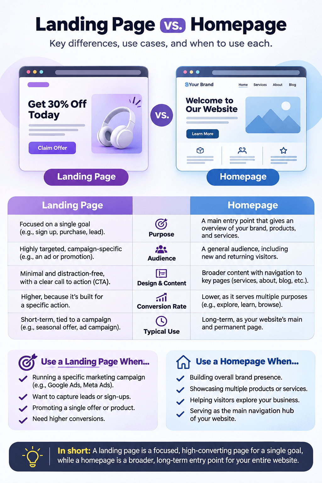
A landing page narrows attention to one action, while a homepage widens it to the whole business. The comparison covers six criteria:
| Criteria | Landing page | Homepage |
|---|---|---|
| Purpose | Drive one conversion, such as a signup, demo request, or purchase | Present the business as a whole |
| Target audience | A defined segment reached by a specific campaign | Mixed audiences: prospects, customers, partners, job seekers |
| Traffic sources | Paid ads, email, social campaigns, partner referrals | Direct visits, branded and organic search, referrals |
| Navigation | Minimal or removed to keep attention on the CTA | Full menu, footer links, and often site search |
| Content depth | Concise copy focused on one offer | Broad overview linking to deeper pages |
| SEO role | Varies by campaign type | Anchors the site’s search presence |
These differences shape how each page gets planned. A landing page starts from the campaign and its audience, while a homepage starts from the site’s information architecture. Mixing the two approaches usually produces a page that does neither job well.
Many companies keep homepage updates in-house and turn to landing page services for campaign pages that need design and copy on tight schedules.
What should a landing page include?
A landing page works when each element supports the same action and removes reasons to hesitate. Its components fall into three groups, from the message itself to the proof behind it.
Clear value proposition and focused messaging
The value proposition tells visitors within seconds what they get and why it matters. A strong headline names the outcome, and a subheading explains how the product delivers it. Message match with the ad or email that brought the visitor keeps the promise consistent.
Conversion-focused design and calls to action (CTAs)
Design on a landing page serves one job: guiding the eye toward the call to action. Patterns that support that job include:
- A single primary CTA, repeated after major content blocks.
- Button text that describes the result, such as “Get the template” instead of “Submit.”
- Short forms that ask for the fields sales actually need.
- Fast loading and a layout that works on mobile screens.
A single-column layout keeps the reading path pointed at the button. Contrast and white space make the CTA stand out without loud colors. Testing one change at a time shows which element moves the conversion rate.
Trust signals and supporting content
Trust signals reduce the risk a visitor feels before sharing an email address or card details. Customer logos, short testimonials with names and roles, ratings from review platforms, and security badges near forms serve this role.
Supporting content answers objections that surface right before conversion. A short FAQ, a pricing note, or a three-step explanation of what happens after signup can resolve doubts without sending the visitor elsewhere. Placing these elements near the CTA keeps them in the decision zone.
What should a homepage include?
A homepage needs enough breadth to orient different visitors and enough clarity to keep them from feeling lost. Its core elements build that balance in a specific order, from identity to action.
Brand introduction and value proposition
The hero section carries the brand introduction: a headline naming the problem the company solves, a supporting line on how, and a primary action. This statement stays broader than a campaign headline, since it covers the whole offer.
A product visual or short video often shows the offer faster than text does. Visitors who cannot tell within seconds what the business does tend to return to search results.
Navigation and content structure
Navigation turns the homepage into a map of the site. A compact main menu, labeled in the visitor’s language rather than internal jargon, helps people find their path.
Below the hero and menu, supporting blocks usually follow a predictable order:
- Proof of credibility, such as client logos, awards, or results.
- Case studies or examples of work.
- Recent articles, guides, or news.
- A footer with contact details, policies, and secondary links.
This sequence answers a new visitor’s questions in turn, from why the company deserves trust to how to reach it.
Services, products, and multiple CTAs
Homepages present the offer as a set of entry points, with a short card for each service, product line, or audience. Each card links to a dedicated page where the details live. That structure keeps the homepage scannable while letting visitors go deeper.
Multiple CTAs suit this page because visitors arrive with different goals. A primary button such as “Book a call” can sit beside secondary options like “View pricing” or “Read the blog,” with visual weight signaling which action matters most.
How do landing pages and homepages differ in SEO and conversions?
In the homepage vs landing page comparison, the homepage usually leads in organic visibility, while the landing page leads in conversion rate. Each contributes to growth from a different side of the funnel.
Homepages tend to collect the most backlinks on a domain and rank for branded queries. Through internal links, they pass that authority to service, category, and product pages. A homepage can also rank for a broad commercial term, though deeper pages usually match specific queries better.
Landing pages split into two types for search. Pages built for organic traffic target one specific query and need indexable, substantial content. Pages made for paid campaigns are often light on text and kept out of the index with a noindex tag, which prevents near-duplicate variants from competing in search.
In paid search, landing page experience is one of three Quality Score components in Google Ads, alongside expected click-through rate and ad relevance. A relevant, fast page can therefore improve ad performance and lower the cost of each conversion.
On conversions, a landing page benefits from a single goal and a matched audience. A homepage tends to show a lower conversion rate, since much of its traffic is still researching. Its contribution is better judged through assisted conversions in analytics, which credit the pages visitors passed through before converting.
Can a homepage serve as a landing page?
A homepage can act as a landing page when the business has one product, one audience, and one main action. Early-stage startups and single-offer SaaS tools often fit this description. A focused hero section and a prominent CTA then let the homepage carry a conversion goal.
For targeted advertising campaigns, a dedicated landing page tends to be the more suitable choice for several reasons:
- Cleaner data: conversions trace back to one campaign and one audience.
- Segment variants: separate pages can address different industries or regions within one campaign.
- Faster launches: a new page goes live without reworking the site’s navigation or homepage.
Sending ad traffic to a general homepage often means paying for clicks that end in browsing rather than action.
When both pages tell the same story
The same person often meets both pages at different moments. A prospect who signs up through a campaign page frequently visits the homepage later to check who stands behind the offer.
When the two pages share a consistent tone, visual style, and promise, that second visit confirms the decision. When they diverge, the homepage can undo the trust the landing page worked to build.