Someone clicks an advertisement because a particular promise catches their attention. The next page should help them recognise that promise, understand its conditions, and decide what to do. When the page looks unrelated or buries the useful details beneath competing headlines, the campaign creates extra work for the visitor.
- Map the promise across the entire journey; collect ad, landing page, and first form; note mismatches before changing design.
- Build a hierarchy around decisions: answer what it is, relevance, cost, and next step with clear size and proximity.
- Turn typography changes into testable hypotheses, measure the right outcome, and keep tests focused on single variable changes.
- Check pages under realistic constraints: long copy, narrow viewports, font loading, and translated content before launch.
Campaign typography is the system of text styles that carries a message across ads, landing pages, forms and follow-up materials. It covers hierarchy, spacing, emphasis and the role of each font. For marketing teams, the useful question is not which typeface guarantees more conversions. It is whether the text helps people understand the offer, and how to test that without confusing design preferences with evidence.
Map the promise across the entire journey
Collect the actual ad, its destination page and the first form or checkout screen. Read them in order on a phone. Identify the product name, headline promise, qualifying details and primary action at each stage. The wording need not be identical everywhere, but the relationship should be obvious.
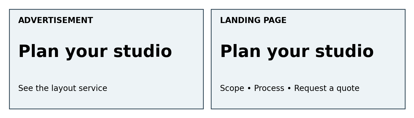
Illustrative campaign for a fictional studio-planning service. The page repeats the core promise and adds the information needed to evaluate it.
Suppose an ad promotes a studio layout consultation, but its destination opens with a broad statement about transforming spaces. That may be accurate brand language, yet it asks the visitor to rediscover the specific service. Restore the service name in a visible heading and explain what the consultation includes. Typography can strengthen that connection; it cannot supply missing substance.
Record mismatches before changing the design. Note whether the problem is absent information, unclear wording, weak emphasis or a rendering issue. These categories lead to different fixes. Replacing a font will not resolve an unexplained delivery fee, and making a vague headline larger will only make the vagueness more prominent.
Choose one journey for the first review
Start with a campaign that has a clear destination and measurable action. Avoid combining every channel, audience and product into one review. A focused journey gives designers and analysts a shared reference, while successful rules can later be tested on other templates.
Build a hierarchy around decisions rather than decoration
List the questions a visitor needs answered: What is this? Is it relevant to me? What does it cost or require? What happens after I click? Give those answers a visible order. The largest text should usually identify the offer or its main benefit, with supporting evidence and conditions nearby.
| Text role | Useful treatment | Mistake to avoid |
| Main promise | One prominent, descriptive heading | Several equally dominant slogans |
| Supporting explanation | Readable paragraphs with clear grouping | Lightweight copy over a busy image |
| Price and conditions | Connected labels and visible qualifiers | Separating a headline price from its basis |
| Primary action | An explicit label with room to wrap | A vague button squeezed into fixed dimensions |
| Evidence | Clear attribution and context | Unlabelled numbers used as decoration |
Emphasis should reflect importance rather than convenience. If a price is monthly but billed annually, keep that relationship readable near the figure. A qualifier that affects the decision should not become almost invisible simply because the card looks cleaner without it. This is a content-design recommendation, not a substitute for reviewing applicable advertising requirements.
Create roles before selecting more families
A single family with appropriate weights may handle the whole page. A second face can add identity to short headings, provided the information hierarchy remains clear. Decide where each style belongs and write that rule down. Otherwise, every new section becomes another opportunity for inconsistent formatting.
Use representative content when testing: the longest product name, a two-line action label, an unfamiliar surname and a price with decimals. A design approved with short placeholder copy can break as soon as a campaign manager adds the real message. Ask for those examples during the brief rather than treating them as edge cases at launch.
Make evidence understandable on its own
A testimonial needs its source and relevant context. A percentage needs a definition, period and basis where those are necessary to interpret it. Keep these details close enough that a reader does not have to search for an explanation. If the claim cannot be substantiated, better typography is not the answer.
Borrow specific lessons from real custom font projects
Domino’s Pizza provides an example of coordinated roles. TypeType’s published project identifies Dominos Sans Display and Dominos Sans Text as customisations of TT Commons™ Pro, created in collaboration with WorkInProgress. The two names reflect distinct display and text applications within the brand’s communications.
For a campaign team, the relevant lesson is to plan how attention-getting headlines relate to smaller reading text. It does not follow that a small company needs a bespoke family, or that copying Domino’s visual style will improve sales. Use the distinction between roles as a briefing tool, then test your own offer.
SHIFTBRAIN’s twentieth-anniversary website illustrates a different requirement. Its custom version of TT Norms® Pro Regular included a variable Width axis and adjusted metrics to work alongside A1 Gothic Regular. The custom font contained Latin letters, numerals and standard punctuation, rather than replacing the Japanese font.
Design lead Marina Khodak said the team “focused on preserving the character of TT Norms® Pro even in its super-wide style.” That is a useful constraint for campaign systems: adapt to a format while preserving a recognisable identity. Neither case establishes a measured conversion lift, so do not present either as performance evidence.
Check the page under less convenient conditions
Inspect the page on narrow screens, with longer content and while fonts are loading. A heading that fits on one desktop line may take four lines on a phone. Let its container grow instead of clipping the text or shrinking it until the promise becomes difficult to read.
The W3C’s guidance for Text Spacing says, “Ensure content adapts to user-defined text settings.” Its criterion tests whether content and functionality survive specified spacing overrides. It does not require every design to use those values as its default styling. Fixed-height boxes that hide enlarged or more widely spaced text deserve particular attention.
| Test condition | Inspect | Practical response |
| Narrow viewport | Heading and button wrapping | Allow flexible heights and useful line breaks |
| Spacing override | Clipping or overlapping text | Remove rigid container assumptions |
| Delayed custom font | Fallback readability and movement | Review the fallback and loading behaviour |
| Longer language version | Labels and qualification text | Test translated copy before approval |
Keep meaning available as text where possible. A screenshot of a headline may preserve the artwork, but it does not behave like adaptable live text. Treat exported ad graphics and the destination website as different delivery formats, even when they share a visual identity.
Turn typography changes into testable hypotheses
A useful hypothesis connects an observed problem with a defined change and an outcome. For example: visitors cannot explain the annual billing condition after reviewing the pricing section; increasing the qualifier’s prominence should improve comprehension. Start by checking that explanation in a usability session before running a conversion experiment.
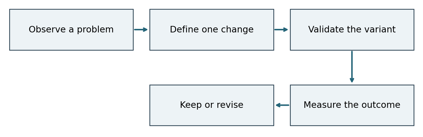
Suggested sequence for evaluating a typography change. The diagram describes a workflow, not measured results or a guaranteed uplift.
Decide what success means before collecting results. For a lead-generation page, qualified inquiries may matter more than button clicks. For a product page, completed purchases and downstream cancellations may be relevant. A more noticeable action can increase clicks without improving the quality of the decision.
Keep the changed variables explicit. If you alter the font, headline wording, price and offer at once, the test evaluates that combined package. It cannot isolate the effect of the font. A broader redesign test can still be useful, but the interpretation must match what actually changed.
Plan the comparison before watching the dashboard
For an A/B test, agree on the eligible audience, random assignment, primary metric and analysis method with the analyst. Determine the sample and duration needed for a meaningful decision before starting. Repeatedly checking results and stopping at the first favourable movement can produce misleading conclusions if the method does not account for that stopping rule.
Keep a log of other campaign changes, including traffic sources and promotions. Do not compare a quiet week before a redesign with a sale week afterward and attribute the difference to typography. If traffic is too limited for a useful experiment, use observed usability problems and technical checks to guide improvements, while being honest about the evidence.
Write a result that another team can assess
Report the tested variation, dates, audience, sample, metric definition and uncertainty. Include screenshots so the result can be understood later. An inconclusive test is still informative about what the available data can support; it is not proof that typography never matters.
Confirm licensing before distributing campaign assets
A campaign may involve a freelance designer, an agency, a website developer and an internal team. Identify who needs editable font files and who only needs finished artwork. Inventory the channels too: static graphics, live website text, paid ads, video and applications may require different rights under the relevant agreement.
If the brief calls for a new family or specific customisation, compare options at typetype with the campaign’s actual copy and distribution plan. Knowing the required styles, languages and outputs makes both design evaluation and licensing discussions more precise.
TypeType lists separate Desktop, Webfont, Digital Ads, Video and other licensing categories. Its webfont pricing considers monthly pageviews and duration, while its digital advertising category considers impressions. Check the applicable agreement and planned scope; other foundries may bundle permissions differently. Evaluation files should not be assumed to cover a public campaign.
Ask about contractor access, file modifications and embedding before handing assets over. Converting lettering to outlines is a production decision, not a substitute for permission. Keep approved files, licensing records and renewal information with the campaign templates so a later adaptation does not rely on someone’s memory.
Release a small system that the team can maintain
Document the approved heading, body, label and action styles with examples. Specify how the layout responds to long copy, and identify the fallback face used on the website. Provide one realistic template for each recurring format instead of a large specimen sheet that never shows the campaign content.
Before release, confirm these points:
- The advertisement and destination describe the same offer.
- Important conditions remain readable beside the relevant claim.
- Mobile layouts and spacing changes do not hide content.
- Metrics and test decisions are defined before launch.
- Licences match the planned outputs and collaborators.
Does every channel need the identical font size
No. A mobile ad, a landing page and a confirmation message have different constraints. Preserve recognisable roles and relationships while adapting size and spacing to the format. Literal sameness can make an otherwise useful system brittle.
Should a brand commission a custom font for CRO
Only if the brief justifies it through recurring identity, language or functional needs. Custom lettering alone does not establish a conversion benefit. Many teams should first improve the hierarchy, content and implementation of the family they already license.
A coherent campaign makes it easy to recognise the offer, evaluate its evidence and take an informed next step. Typography supports that sequence when it is treated as part of the content and delivery system. Improve the actual reading task, measure the outcome you care about, and preserve the rules that help the next campaign work consistently.