Skip to content
Why Your Design Presentations Might Be Failing
Picture this: You’ve spent weeks perfecting a design concept. The functionality is flawless, the aesthetics are refined, and every element serves a clear purpose. Yet when you present it to stakeholders, their confused expressions tell you something’s wrong. Despite your eloquent explanation, they’re simply not seeing your vision.
This disconnect between designer intent and stakeholder understanding is remarkably common. The issue isn’t with your design—it’s with how you’re communicating it.
Design presentations fail for several key reasons:
- Terminology misalignment: You’re using industry jargon that stakeholders don’t understand
- Perception gaps: What seems obvious to you isn’t obvious to others
- Information overload: Too many details overwhelm your core message
- Medium mismatch: Your communication method doesn’t match your audience’s learning style
Research by the Nielsen Norman Group found that stakeholders typically remember only 10% of verbal presentations but retain up to 65% of information when it’s presented visually. This striking difference highlights why effective visual communication is critical to design success.
Visual Communication: More Than Just Pretty Pictures
Visual communication operates on two levels:
- Communication design – crafting messages that educate, motivate, and engage.
- Graphic design – using design principles to deliver those messages clearly and effectively.
Here’s the crucial insight many designers miss: imagery isn’t just decoration supporting your words—it IS the communication.
As Jim Kessler, Director of the Visual Media Group at Jacobs, observed: “A photorealistic rendering signals completion and suggests design changes are no longer possible, whereas a non-photorealistic visual suggests a sense of flux.”
Your choice of visual style, detail level, and presentation format tells stakeholders exactly:
- Where you are in the design process.
- What kind of feedback you’re seeking.
- How open you are to changes.
This visual language operates on both conscious and subconscious levels. The color palette you choose, for instance, doesn’t just affect aesthetics—it triggers emotional responses. .Studies show blue creates feelings of trust and reliability, while orange stimulates creativity and enthusiasm. These subtle cues become part of your design’s communication whether you intend them to or not.
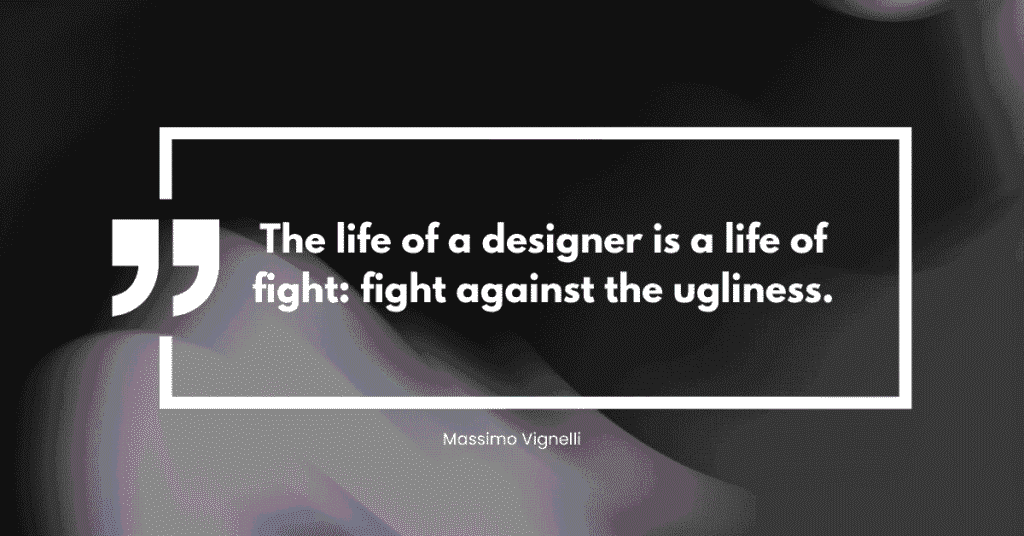
Legendary designer Massimo Vignelli emphasized this point: “The life of a designer is a life of fight: fight against the ugliness.” This fight extends beyond aesthetics to clarity—making the complex understandable through thoughtful visual communication.
The Psychology of Visual Intent
Consider how different imagery styles affect stakeholder interpretation. A rough sketch communicates “we’re exploring ideas together” while a polished rendering says “this is the solution.” The imagery doesn’t just show the design – it shapes the entire conversation around it.
Frank Gehry understood this intuitively when he said, “I like the idea of architecture being a form of communication.” Every visual choice becomes part of that communication, from the lighting conditions you choose to the perspective you present.
When stakeholders see imagery that matches their expectations for the project phase, they engage more constructively. When the imagery conflicts with those expectations, they focus on the wrong things.
Beyond Pretty Pictures
The most effective design imagery serves strategic communication purposes that extend far beyond aesthetics. Instead of simply showing what something looks like, strategic imagery demonstrates how it works, why it matters, and what it accomplishes.
Consider the difference between a standard architectural rendering and one that shows people actually using the space. The second version doesn’t just communicate design intent – it communicates design impact. Render Vision understands this distinction, creating imagery that serves the communication goal rather than just showcasing technical capabilities.
Research found that 83% of people prefer to learn instructional or informational content by video over text or audio only. This preference extends to design communication – stakeholders absorb and retain visual information more effectively than verbal descriptions.
The Attention Challenge
Microsoft conducted a study that revealed a person’s attention span is roughly 8 seconds. With so little time to make an impact, your imagery needs to communicate design intent immediately and effectively.
This constraint actually works in designers’ favor. While verbal explanations require linear processing, visual information is processed parallel – stakeholders can grasp complex relationships and hierarchies instantly when presented visually.
Saul Bass captured this perfectly: “I want to make beautiful things, even if nobody cares, as opposed to ugly things. That’s my intent.” The visual beauty isn’t superficial – it’s functional, drawing attention and creating the mental space necessary for understanding complex ideas.
The most effective design imagery goes beyond showing what something looks like—it demonstrates how it works, why it matters, and what it accomplishes.
Consider the difference between:
- A standard architectural rendering showing an empty space.
- The same space populated with people actively using it.
- A series of views showing the space at different times of day with different user groups.
- An interactive visualization allowing stakeholders to “walk through” the space virtually.
Each approach progressively increases understanding and emotional investment. The second version doesn’t just communicate design intent—it communicates design impact. The third shows versatility. The fourth creates immersion.
This distinction is crucial when research shows that 83% of people prefer learning through visual content rather than text alone. Furthermore, people retain 80% of what they see compared to just 20% of what they read.
Strategic imagery showcases:
- Context: How the design fits into its environment.
- Function: How users interact with the design.
- Benefits: What problems the design solves.
- Evolution: How the design can adapt over time.
IDEO, one of the world’s leading design firms, regularly uses “scenario visualizations”—series of images showing people interacting with designs in realistic contexts. This approach helps stakeholders understand not just the design itself but its purpose and impact.
Capturing Attention in 8 Seconds
Microsoft research reveals that the average human attention span is roughly 8 seconds—less than that of a goldfish (9 seconds). This constraint actually works in designers’ favor:
- While verbal explanations require linear processing.
- Visual information is processed in parallel—allowing stakeholders to grasp complex relationships instantly.
This cognitive efficiency explains why:
- Infographics are shared 3x more than documents on social media.
- YouTube viewers retain 95% of a message when watching a video compared to 10% when reading text.
- Presentations with visual aids are 43% more persuasive.
As Saul Bass noted: “I want to make beautiful things, even if nobody cares, as opposed to ugly things. That’s my intent.” The visual beauty isn’t superficial—it’s functional, drawing attention and creating mental space for understanding complex ideas.
To maximize this brief attention window:
- Lead with impact – Put your most compelling visual first.
- Create visual hierarchy – Guide the eye to what matters most.
- Reduce cognitive load – Eliminate unnecessary details.
- Use pattern recognition – Leverage familiar visual conventions.
- Incorporate movement – Animations and transitions maintain attention.
Apple’s product presentations exemplify this approach, using minimal text and focusing on large, clear visuals that communicate product benefits instantly.
Choosing the Right Visual Language
Different design phases require different visual approaches to communicate intent effectively:
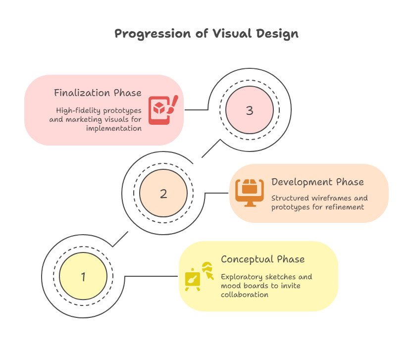
Conceptual Phase
Use exploratory, sketchy representations that invite collaboration and suggestions
During this phase, effective visuals include:
- Hand sketches (even deliberately “unfinished” looking).
- Simple block diagrams.
- Mood boards and inspiration collages.
- Low-detail wireframes.
- Concept maps showing relationships between ideas.
Designer and educator Michael Bierut often begins projects with intentionally rough sketches on yellow trace paper. This approach signals to clients that ideas are fluid and input is welcome.
Development Phase
Show systematic thinking and refined solutions while indicating flexibility for adjustments
Appropriate development phase visuals include:
- Structured wireframes with increasing detail.
- Flow diagrams showing user journeys.
- Grayscale or limited color mockups.
- Functional prototypes of key interactions.
- Component libraries showing design systems.
IDEO designer Tim Brown advocates for “sacrificial concepts” during this phase—visualizations detailed enough to be meaningful but clearly not final, encouraging constructive feedback.
Finalization Phase
Demonstrate completeness and professional execution, signaling implementation readiness
Finalization imagery includes:
- High-fidelity prototypes
- Photorealistic renderings
- Detailed specifications and measurements
- Implementation guidelines
- Marketing-ready visuals
The most common mistake? Using highly polished imagery too early (shutting down valuable feedback) or rough sketches too late (undermining stakeholder confidence).
Dieter Rams, the influential industrial designer, observed: “Good design is thorough down to the last detail.” Your finalization imagery should reflect this thoroughness, showing that all aspects have been considered.
The Emotional Connection
Effective design imagery does something subtle but powerful – it helps stakeholders envision themselves benefiting from the design. Charles Eames observed that “Design is a plan for arranging elements in such a way as best to accomplish a particular purpose.”
When your imagery clearly shows that purpose being fulfilled, stakeholders move from analyzing your design to imagining its success. This emotional shift is crucial for gaining approval and support.
Techniques for creating emotional connections include:
- Storytelling sequences: Series of images showing a user journey.
- Day-in-the-life scenarios: Visualizations of the design in daily use.
- Before-and-after comparisons: Contrasting current pain points with your solution.
- Contextual placement: Showing the design in its intended environment.
- Human elements: Including people who represent the target users.
Jennifer Morla noted that “Design brings content into focus; design makes function visible.” The best design imagery accomplishes both – it focuses attention on what matters most while making abstract functionality tangible and understandable.
Technical vs. Emotional Communication
One of the biggest challenges in design communication is striking the right balance:
- Pure technical drawings communicate function but fail to convey experience.
- Pure aesthetic renderings communicate atmosphere but leave questions about implementation.
- Effective imagery bridges both needs, showing how something works while inspiring confidence.
This balance varies by audience:
- Engineers need more technical detail and precise specifications.
- Executives respond to business impact and big-picture benefits.
- End users connect with experiential and emotional elements.
- Project managers focus on implementation considerations.
Successful firms like IDEO and Frog Design often create different visualization sets for different stakeholders, each emphasizing the aspects most relevant to that audience.
Techniques for achieving balance include:
- Layered information – Core visuals with progressive disclosure of technical details.
- Split presentations – Technical specifications alongside experiential imagery.
- Annotated renderings – Beautiful visuals with practical callouts and explanations.
- Interactive prototypes – Allowing stakeholders to toggle between technical and experiential views.
Norman Foster’s architectural practice exemplifies this approach, combining highly technical construction details with emotionally resonant visualizations of completed spaces. This dual approach ensures both technical feasibility and emotional buy-in.
The Iteration Advantage
One unexpected benefit of communicating through imagery is how it improves the design itself. When you’re forced to visualize your intent clearly enough for others to understand, you often discover aspects of the design that need refinement.
Erik Adigard understood this when he said “Design is in everything we make, but it’s also between those things. It’s a mix of craft, science, storytelling, propaganda, and philosophy.” Creating imagery that communicates design intent requires engaging with all these dimensions simultaneously.
Making Your Design Communication Strategic
The most successful designers understand that imagery isn’t just a presentation tool – it’s a design tool. The process of creating visuals that communicate intent often reveals new possibilities and solutions.
When you approach imagery creation strategically, asking “What does this need to communicate?” rather than “How can I make this look good?”, the resulting visuals become powerful allies in the design process.
Le Corbusier famously said, “I prefer drawing to talking. Drawing is faster, and leaves less room for lies.” In the context of design communication, imagery doesn’t just support your intent – it reveals whether that intent is clear, compelling, and achievable.
The question isn’t whether you should use imagery to communicate design intent. The question is whether you’re using it strategically to achieve the understanding and support your designs deserve.