Skip to content
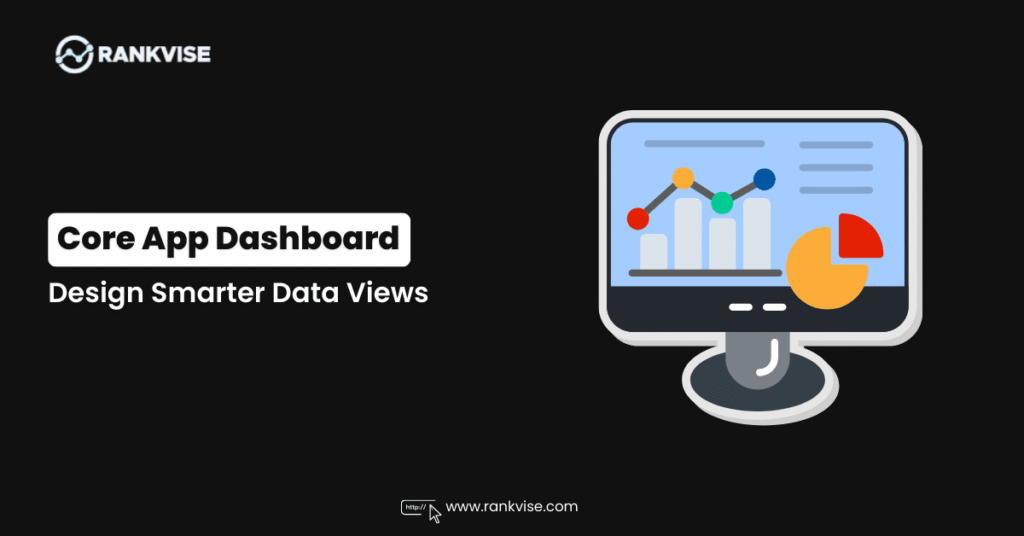
Most dashboards fail quietly. They display data without delivering insight. Teams glance at charts, nod politely, and then open a spreadsheet to find the answers they actually need.
- Design dashboards to answer specific questions, showing only the metrics needed to drive a single decision.
- Match visual types to the question: KPI cards for current state, line charts for trends, bar charts for comparisons.
- Prioritize layout and usability: place top-left priority metric, limit each view to one decision, use color intentionally, design mobile-first.
A well-designed core app dashboard changes that pattern entirely. It puts the right information in front of the right people at the right moment. No hunting. No guessing. Just clarity that leads to action.
This guide walks you through what makes a core app dashboard effective, which visual types work best, how to avoid common layout mistakes, and how to design for real business outcomes rather than decoration.
What Is a Core App Dashboard and Why Does It Matter?
A core app dashboard is the central interface where users monitor, analyze, and act on an application’s most important data. It pulls together key metrics, trends, and alerts into a single view tailored to how people actually work.
Unlike a static report, a dashboard updates continuously. Sales leaders see pipeline movement in real time. Operations managers spot bottlenecks before they escalate. Product teams track feature adoption the moment it happens. The dashboard becomes the nerve centre of daily decisions.
What separates a great dashboard from a forgettable one is focus. The best data visualization dashboards answer specific questions instead of dumping every available metric onto a screen. That distinction shapes every design choice that follows.
Core Components Every Dashboard Needs
Not all dashboards look alike, but effective ones share a common foundation. These components work together to create an experience that is both informative and easy to navigate.
- KPI cards display headline metrics like revenue, active users, or uptime percentage at a glance. They answer the question “how are we doing right now?” in under two seconds.
- Trend charts show how metrics change over time. A line chart revealing a steady decline in customer retention tells a very different story than a single number on a card.
- Comparison visuals such as bar charts and grouped columns help users evaluate performance across regions, products, or time periods side by side.
- Filters and controls let users narrow data by date range, department, geography, or any relevant dimension without leaving the dashboard.
- Alerts and thresholds draw attention to metrics that have crossed a critical boundary, such as server response time exceeding acceptable limits.
- Navigation elements connect users to deeper reports or related views when they need more detail than the summary provides.
Each component serves a distinct purpose. When they are arranged thoughtfully, the dashboard layout design guides the eye naturally from summary to detail.
Choosing the Right Visual for the Right Question
One of the most common dashboard mistakes is using the wrong chart type. A pie chart showing twelve categories becomes unreadable. A table with hundreds of rows overwhelms rather than informs. Matching the visual to the question is a skill that separates useful dashboards from decorative ones.
| Visual Type | Best Question It Answers | When to Avoid It |
|---|---|---|
| KPI card | What is the current value of one metric? | When context or trend matters more than the number |
| Line chart | How has this metric changed over time? | When comparing categories, not time periods |
| Bar chart | How do categories compare to each other? | When showing more than eight categories |
| Heatmap | Where are the concentrations or patterns? | When users need exact values, not patterns |
| Table with sorting | What are the specific values behind the data? | When quick scanning matters more than precision |
| Gauge or progress bar | How close are we to a goal or threshold? | When there is no defined target to measure against |
| Sparkline | What is the micro-trend next to a KPI? | When the trend itself needs detailed analysis |
This table should guide every visual decision in your core app dashboard. Start with the question, then pick the format. Never the other way around.
Five Design Principles That Improve Dashboard User Experience
Dashboard design best practices have evolved significantly. Aesthetic appeal matters, but usability matters more. These five principles keep your real-time dashboard functional under pressure.
Start with the Most Important Insight
Place your highest-priority metric in the top-left corner of the screen. That is where eyes land first in left-to-right reading cultures. If your sales dashboard exists to track monthly revenue against target, that comparison belongs at the top, not buried below a chart about website visits.
Limit Each View to One Decision
Every screen or tab in your dashboard should help a user make one type of decision. Mixing marketing metrics with infrastructure health data on the same view forces users to context-switch constantly. Separate concerns into distinct views connected by intuitive navigation.
Use Colour with Intention
Colour should communicate status, not just brand identity. Reserve red for problems, green for healthy states, and amber for caution. Use neutral tones for everything else. This restraint ensures that when colour does appear, it immediately draws attention where it belongs.
Accessibility matters here too. Roughly eight percent of men experience some form of colour vision deficiency. Pair colour with icons, labels, or patterns so meaning is never lost.
Design for the Smallest Screen First
Many teams view dashboards on laptops during meetings or on phones between appointments. A layout that only works on a 27-inch monitor fails the people who need it most. Responsive dashboard layout design ensures readability across devices without requiring a separate mobile version.
Reveal Detail Progressively
Show the summary first. Let users click, hover, or drill down to find granular data only when they need it. This progressive disclosure approach keeps the default view clean while still giving analysts the depth they require. Dense dashboards overwhelm casual users. Layered dashboards serve everyone.
Real-World Scenarios Where Core App Dashboards Deliver Value
Theory is useful. Practice is convincing. Here is how different teams use a core app dashboard to solve real problems.
E-commerce operations teams monitor order fulfilment rates, shipping delays, and return volumes on a single app performance dashboard. When a fulfilment centre falls behind, the dashboard flags the delay before customer complaints arrive. The operations lead reassigns resources within minutes instead of hours.
SaaS product teams track feature adoption, error rates, and user session lengths. When a new release causes a spike in errors, the business intelligence dashboard highlights the anomaly immediately. The team rolls back the change before it impacts retention metrics.
Healthcare administration uses dashboards to monitor patient wait times, bed occupancy, and staffing levels across facilities. A real-time dashboard showing rising wait times at one location triggers a staffing adjustment that reduces average wait by fifteen minutes within a single shift.
Field service companies display technician locations, job completion rates, and parts inventory on a centralized dashboard. Dispatchers assign the nearest available technician to urgent jobs, cutting response times and improving first-visit resolution rates.
These scenarios share a common thread. The dashboard does not just display data. It accelerates the path from observation to action.
Common Layout Mistakes That Undermine Clarity
Even well-intentioned dashboards fall into predictable traps. Recognizing these mistakes early saves weeks of redesign later.
- Metric overload is the most frequent problem. Displaying thirty KPIs on one screen means none of them get proper attention. Limit each view to five or six primary metrics.
- Inconsistent time ranges confuse users when one chart shows weekly data and another shows monthly data on the same screen. Align time dimensions or label them clearly.
- Decorative chart choices like 3D pie charts or donut charts with too many slices sacrifice readability for visual flair. Choose function over style every time.
- Missing context turns numbers into noise. A conversion rate of 3.2 percent means nothing without knowing whether that is above or below the benchmark, and whether it is rising or falling.
- Ignoring load time frustrates users. A dashboard that takes eight seconds to render loses its real-time value. Optimize queries, cache static data, and paginate heavy tables.
Avoiding these mistakes is not glamorous work, but it is the difference between a dashboard people actually use and one they quietly abandon.
Tools and Platforms Worth Considering
You do not need to build a core app dashboard from scratch. Several mature platforms accelerate development while maintaining flexibility.
Business intelligence platforms like Tableau, Power BI, and Looker offer drag-and-drop interfaces with strong data connectivity. They suit teams that want powerful analytics without heavy custom development. Embedded analytics platforms such as Sisense and Logi Analytics let you integrate dashboards directly into your existing application, preserving your brand experience.
For teams with specialized needs, visualization libraries like D3.js and Apache ECharts provide full creative control. They require front-end development expertise but deliver pixel-perfect results when off-the-shelf options fall short.
Cloud providers also offer native options. AWS QuickSight and Google Looker Studio integrate tightly with their respective ecosystems, reducing setup time for teams already invested in those platforms.
The right choice depends on your team’s technical skill, budget, and how deeply the dashboard needs to integrate with your product.
How to Measure Whether Your Dashboard Is Working
Building the dashboard is only half the job. You also need to know if people find it useful.
Track adoption metrics like daily active users, average session duration, and which filters or views get the most interaction. If users log in but spend less than thirty seconds before leaving, the dashboard likely is not answering their questions.
Gather qualitative feedback through short surveys or interviews. Ask users what decision they made last week based on the dashboard. If they struggle to name one, the content needs rethinking.
Monitor support requests related to data interpretation. A rising volume of questions like “what does this chart mean?” signals a clarity problem. Reduce those questions by improving labels, adding contextual tooltips, and simplifying visual choices.
A core app dashboard succeeds when it becomes the first place people look for answers, not the last.
FAQs
It centralizes key metrics and real-time data so teams can monitor performance, spot issues, and make faster decisions from a single interface.
Start with the question each chart must answer. Use line charts for trends, bar charts for comparisons, and KPI cards for single headline metrics.
Place the most important metric top-left, limit each view to one decision type, use colour intentionally, and reveal detail progressively through drill-downs.
Yes. Design with the smallest screen in mind first. Responsive layouts, simplified views, and touch-friendly controls ensure usability across phones and tablets.
It depends on the use case. Operational dashboards benefit from real-time or near-real-time updates, while strategic dashboards can refresh daily or weekly.