SaaS design research becomes more useful when references match the screen being built. A dashboard raises different questions from a pricing page, while onboarding needs more context than one polished screenshot. The sites below focus on real interfaces, flows, or SaaS patterns for founders, product teams, and designers. Prices were checked in September 2026 where reliable public pricing was available.
- Pick the right library for the job: Page Flows for journeys, SaaSFrame for editable Figma files, Nicelydone for text search, SaaSUI for free patterns.
- Use search, filters, and stage separation to compare equivalent screens across products instead of copying single examples.
- Include non happy path states and apply usability heuristics: loading, empty, validation, errors, and recovery to inform robust design decisions.
What Makes a SaaS Design Inspiration Site Useful?
A good SaaS reference library should help a team reach a specific screen quickly. Search and filters matter when the task involves signup, billing, upgrades, settings, or dashboards. Real shipped interfaces are particularly useful for studying practical choices around structure, states, and conversion steps. Flow context adds more information when several screens form one task.
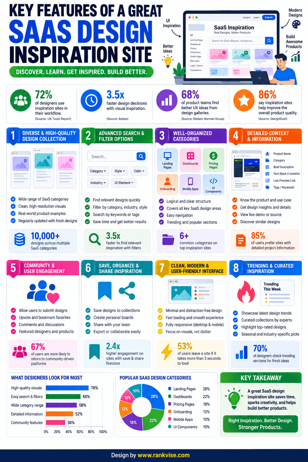
The strongest libraries also make it possible to compare the same problem across several products rather than copying one solution. That matters because a pattern can look convincing in isolation but serve a very different audience, business model, or product maturity level. A useful reference set should therefore show enough alternatives to separate a common SaaS convention from a company-specific design choice.
It also helps to look beyond the default or “happy path.” Loading states, empty states, validation, confirmations, permission prompts, and error recovery are useful parts of an interface to study. Nielsen Norman Group’s usability heuristics emphasize visibility of system status, consistency, error prevention, and helping users recognize and recover from errors, providing a practical framework for reviewing these states.
Page Flows
Page Flows works especially well when the order of screens matters. It includes user flow recordings, screens, UI elements, and email examples from real products. For SaaS research, pageflows.com can help with signup, onboarding, account settings, checkout, invitations, and other multi step journeys. A team can inspect how users move through a task instead of viewing one screen alone.
The quarterly option is listed at $13 per user per month and billed at $39 per quarter. The yearly option is $8.25 per user per month and billed at $99 per year. A team plan is listed at $199 per year. Paid access includes flow recordings, emails, screens, UI elements, filtering, batch screen downloads, and bookmarks.
One practical way to use Page Flows is to record the number of steps, decision points, form fields, confirmation screens, and exits in comparable journeys. This makes the reference useful for product planning as well as visual design. It can also reveal where a product explains a requirement before asking for input, where optional steps appear, and what happens immediately after a task is completed.
For longer flows, it is useful to separate the journey into stages rather than treating the recording as one reference. A signup flow, for example, can be divided into account creation, verification, initial setup, and the first product action. That makes it easier to compare the same stage across multiple SaaS products without allowing differences elsewhere in the flow to distort the comparison.
SaaSFrame
SaaSFrame focuses on SaaS marketing pages, product interfaces, and email sequences. Its library contains more than 5,000 real world UX and UI examples. Categories cover pricing pages, dashboards, landing pages, account setup, and many other common screens. Many entries also provide Figma files for closer layout study. The monthly plan costs $14, while the quarterly option costs $36 every three months.
SaaSFrame is also useful when the same idea needs to be checked across desktop and mobile. Its current Pro feature list includes mobile versions, filtering and search across screens and flows, bookmarks, and access to Figma files. The site also organizes examples into granular categories such as product tours, verification, analytics, tables, integrations, billing, checkout, plans, upgrading, and usage, which can shorten research for a narrowly defined feature.
This makes the library relevant beyond visual inspiration. A marketing team can compare landing, pricing, comparison, integration, customer story, and enterprise pages, while a product team can move directly into product tours, settings, billing, tables, analytics, and other in-app screens. The distinction is useful when the same SaaS project requires both acquisition pages and the interface customers see after signup.
Nicelydone
Nicelydone is useful when research begins with a precise interface question. It covers more than 500 SaaS apps and lets users search text found inside screenshots. Filters can narrow results by app, category, or flow. Complete flows and individual components are also available for more detailed comparison.
A free account includes limited previews. Solo costs $15 per month when billed yearly. Team starts at $30 per month for two seats when billed yearly. Paid access adds the full screen library, unlimited collections and favorites, and broader search access.
Nicelydone can be particularly valuable when the wording inside an interface matters as much as its layout. The current pricing page lists access to more than 202,200 screens for paid plans, text search inside screenshots, filters by app, category, or flow, and the ability to view examples that sit behind product paywalls or trials. Shared collections on the Team plan can also make it easier to keep research visible to several designers instead of storing screenshots in separate personal folders.
Text search can also change the way a research question is framed. Instead of looking only for a category such as “billing,” a researcher can search for interface language connected with actions or states and then compare how different products present that concept. This is useful when researching microcopy, calls to action, upgrade prompts, empty-state messages, or labels alongside the visual treatment.
SaaS Interface
SaaS Interface organizes examples around SaaS pages and components. Categories include dashboards, checkout, pricing, billing, settings, onboarding, forms, tables, signup, and messaging. This structure is useful when the design task is already clearly defined. The latest indexed pricing page available during this check listed Individual lifetime access at $39, reduced from $49. Team lifetime access for up to five users was listed at $159, reduced from $199.
The page-versus-component split is one of the more practical parts of SaaS Interface. A researcher can begin with a complete page such as billing or settings and then narrow the comparison to filters, search, menus, side panels, modals, or bulk actions. The pricing page states that new design inspiration is added monthly, so the lifetime model is not presented as access only to a fixed archive.
That structure can also prevent an overly broad comparison. A team designing a data-heavy settings page may need inspiration for the overall information architecture and separate references for individual controls. Looking at pages first and components second keeps those two questions separate instead of expecting one screenshot to answer both.
SaaSUI
SaaSUI uses a pattern based structure for browsing real SaaS interfaces. Its categories include dashboards, onboarding, pricing, settings, tables, billing, analytics, integrations, and empty states. The site reports more than 3,500 screenshots from over 140 SaaS products and more than 20 interface pattern types. SaaSUI describes its library as free to use, making it an accessible option for early research.
SaaSUI adds another useful browsing dimension by combining pattern types with software categories. Its current library reports 22+ pattern types and 40+ categories, so a dashboard can be studied both as a general interface pattern and within contexts such as analytics, CRM, project management, developer tools, or marketing automation. That can help avoid comparing interfaces built around substantially different product tasks.
The pattern library also includes specific areas that may be missed when research focuses only on full pages. Current categories include login, signup, navigation, empty states, modals, forms, tables, profiles, search, notifications, editors, chat, email, calendars, and integrations. This makes it possible to move from a broad product category to an individual interaction pattern without changing research sources.
Quick Comparison
Page Flows is suited to complete user journeys where sequence matters. SaaSFrame covers product UI, marketing pages, emails, and downloadable Figma files. Nicelydone stands out for detailed screenshot search, including text inside images. SaaS Interface uses a one time payment model, while SaaSUI provides free access to a focused SaaS pattern library.
The choice can also depend on the output expected from the research. Page Flows is a stronger fit when the deliverable is a journey map or step-by-step flow comparison. SaaSFrame can support research that needs to move toward editable design work through Figma files. Nicelydone is practical for large-scale discovery around specific interface wording or categories. SaaS Interface works well for a structured page-and-component audit, while SaaSUI is useful for pattern comparisons across different SaaS categories.
How to Research SaaS Screens Without Collecting Random References
Start with the decision that needs to be made. For an upgrade screen, collect upgrade and billing examples rather than broad dashboard references. Compare several products and note differences in hierarchy, copy, plan visibility, buttons, and next steps. This keeps the research tied to a product question instead of becoming a large folder of unrelated screenshots. SaaSUI, for example, separates pricing, billing, and upgrade related patterns, while other libraries organize references by flows or screen categories.
For onboarding, signup, checkout, and account changes, sequence usually matters most. Flow references show where information is requested, when confirmation appears, and how steps connect. Dashboards and settings can often be researched through static comparisons of layout, density, and grouping. Choosing the reference source around the actual design question keeps the research narrower and easier to apply.
A useful final pass is to separate observations from decisions. An observation might be that most references place account navigation in a persistent sidebar, while the design decision is whether that solution fits the current product. The first comes from reference research; the second should also consider the product’s own content, users, technical constraints, and existing design system.
References can also be checked against basic usability principles before a pattern is carried into a new interface. Consistent terminology, visible system feedback, error prevention, clear recovery options, and keeping essential information prominent are among the principles covered by Nielsen Norman Group’s usability heuristics. This provides a second filter beyond simply asking whether a pattern is common or visually appealing.
Final Thoughts
There is no single best source for every SaaS design task. Page Flows fits flow research, SaaSFrame offers broad SaaS coverage, and Nicelydone supports precise screenshot discovery. SaaS Interface is useful for page and component browsing, while SaaSUI offers free pattern based research. The strongest choice depends on whether the current work centers on a screen, a complete journey, or comparison across several SaaS products.