Someone just gave you their email address and created a password. It is the highest-intent moment they will have with your product, and most teams answer it with the word “Success.”
- Confirm account, give one clear next action, and include a support fallback like "resend verification email."
- Match message length to its surface: toast under 60 characters, modal 1–2 sentences, full page 2–4 sentences with a primary action.
- When verification is required, echo the email, tell where it went, show expiration, and include a clear resend option.
- Make confirmations accessible: announce via ARIA live regions, avoid color alone, do not auto-dismiss critical messages, and move focus to primary action.
A registration success message has one job with three parts: confirm that something happened, say what to do next, and catch the people for whom it did not quite work. Get that wrong and users go hunting through their spam folder, or simply close the tab.
Here are 21 examples organised by scenario, plus the rules that make them work.
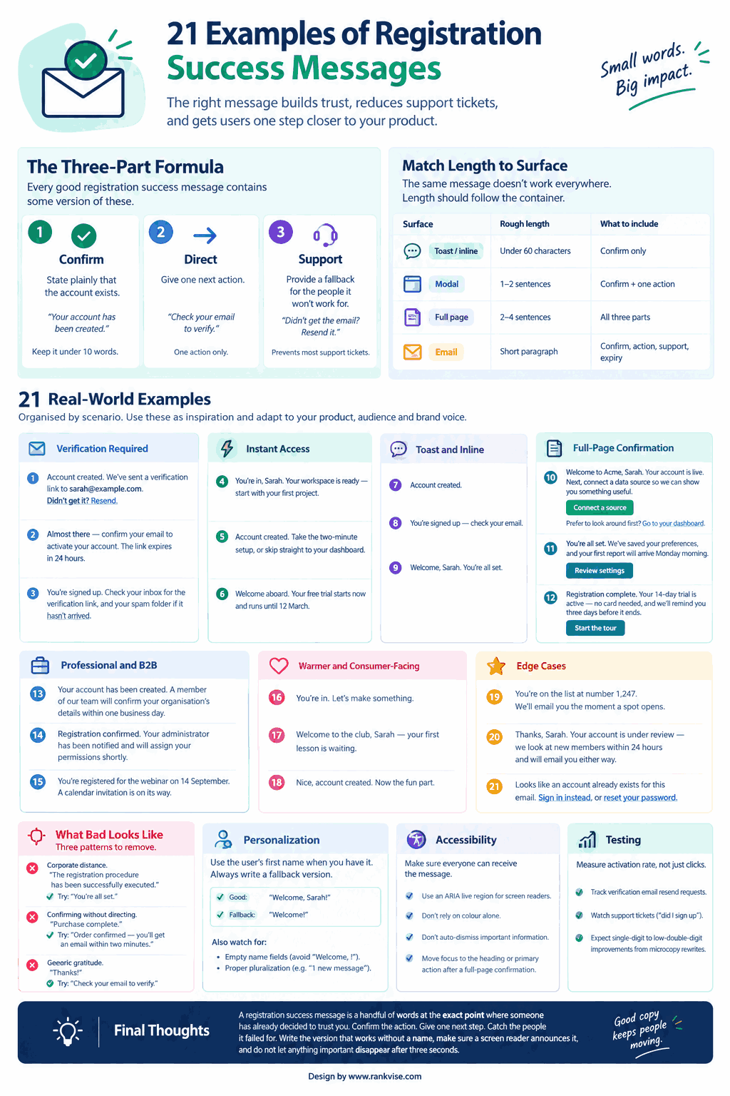
The Three-Part Formula
Every good registration success message contains some version of these.
1. Confirm. State plainly that the account exists. “Your account has been created.” Keep it under ten words. Vague language like “Thanks!” tells the user nothing — not whether the account was made, not whether verification is pending.
2. Direct. Give one next action. Not three. “Check your email to verify” or “Go to your dashboard.” Multiple competing calls to action at this moment reliably reduce how many people take any of them.
3. Support. Provide a fallback for the people it will not work for. “Didn’t get the email? Resend it.” This single line prevents most of the support tickets a signup flow generates.
The most common failure is stopping after part one.
Match Length to Surface
The same message does not work everywhere. Length should follow the container.
| Surface | Rough length | What to include |
|---|---|---|
| Toast / inline | Under 60 characters | Confirm only |
| Modal | 1–2 sentences | Confirm + one action |
| Full page | 2–4 sentences | All three parts |
| Short paragraph | Confirm, action, support, expiry |
A toast carrying 300 characters is a design problem. A full-page confirmation carrying 50 characters is a wasted screen — it almost certainly lacks a call to action and a support link.
Verification Required
The most common scenario and the one most often mishandled. Users need to know where the email went, and what to do when it does not arrive.
- “Account created. We’ve sent a verification link to sarah@example.com. Didn’t get it? Resend.“
- “Almost there — confirm your email to activate your account. The link expires in 24 hours.”
- “You’re signed up. Check your inbox for the verification link, and your spam folder if it hasn’t arrived in two minutes.”
Echoing the actual email address back matters more than it looks. Typos in the email field are the single largest cause of failed activations, and showing the address lets people catch their own mistake immediately.
Instant Access
No verification gate, so the message should hand the user straight to something useful.
- “You’re in, Sarah. Your workspace is ready — start with your first project.”
- “Account created. Take the two-minute setup, or skip straight to your dashboard.”
- “Welcome aboard. Your free trial starts now and runs until 12 March.”
Example six does something worth copying: it states the trial end date explicitly. Vagueness about billing is where trust erodes fastest.
Toast and Inline
Short by necessity. Confirm and nothing else.
- “Account created.”
- “You’re signed up — check your email.”
- “Welcome, Sarah. You’re all set.”
If your flow genuinely needs the user to do something next, a toast is the wrong container. Use a page or a modal.
Full-Page Confirmation
Room for all three parts, plus one clear primary action.
- “Welcome to Acme, Sarah. Your account is live. Next, connect a data source so we can show you something useful. [Connect a source] — Prefer to look around first? Go to your dashboard.”
- “You’re all set. We’ve saved your preferences, and your first report will arrive Monday morning. [Review settings]“
- “Registration complete. Your 14-day trial is active — no card needed, and we’ll remind you three days before it ends. [Start the tour]“
Note that each has one primary button and, at most, one quiet secondary option. That hierarchy is the point.
Professional and B2B
Where an approval or provisioning step sits between registration and access, say so explicitly. Silence here reads as a broken form.
- “Your account has been created. A member of our team will confirm your organisation’s details within one business day.”
- “Registration confirmed. Your administrator has been notified and will assign your permissions shortly.”
- “You’re registered for the webinar on 14 September. A calendar invitation is on its way.”
Warmer and Consumer-Facing
Personality is fine, provided the information still lands.
- “You’re in. Let’s make something.”
- “Welcome to the club, Sarah — your first lesson is waiting.”
- “Nice, account created. Now the fun part.”
One caution: playful copy works when the action genuinely succeeded and nothing is pending. If the user still needs to verify an email, wit at the expense of clarity costs you activations.
Edge Cases
These three states are handled badly almost everywhere, which makes them the easiest place to stand out.
- Waitlist: “You’re on the list at number 1,247. We’ll email you the moment a spot opens.”
- Pending approval: “Thanks, Sarah. Your account is under review — we look at new members within 24 hours and will email you either way.”
- Already registered: “Looks like an account already exists for this email. Sign in instead, or reset your password.”
Example 21 is not technically a success message, but it appears at the same moment in the flow and determines whether someone gets into your product or gives up. Worth writing as carefully as the rest.
What Bad Looks Like
Three patterns to remove.
Corporate distance. “The registration procedure has been successfully executed.” Nobody speaks like this. Try: “You’re all set.”
Confirming without directing. “Purchase complete.” Better: “Order confirmed — you’ll get an email within two minutes.”
Generic gratitude. “Thanks!” leaves the user unsure whether anything happened at all.
The underlying rule: tell people what happens next, not only what just happened.
Personalization, and Its Failure Mode
Using someone’s first name is the cheapest warmth available, and it works.
But build the fallback. If your form does not require a name, or the field arrives empty, “Welcome, !” or “Welcome, undefined” undoes every bit of goodwill the message was meant to create. Always write a version that reads correctly with no name at all.
The same discipline applies to pluralization. “1 new messages” is a small thing that signals nobody checked.
Accessibility Notes
Success messages are among the most commonly inaccessible elements in a signup flow, and the fixes are straightforward.
- Announce it to screen readers. A visually rendered toast that is not in a live region simply does not exist for some users. Use an appropriate ARIA live region so the confirmation is read out.
- Do not rely on colour alone. A green background is not the message. The words must carry the meaning on their own.
- Do not auto-dismiss critical information. A toast that disappears after three seconds is fine for “Saved.” It is not fine for “Check your email to verify” — that belongs somewhere persistent.
- Move focus deliberately. After a full-page confirmation, focus should land on the heading or the primary action, not remain on a form that no longer exists.
Testing What You Write
Registration is a high-traffic, high-intent moment, which makes it unusually well suited to testing.
Measure activation rate rather than clicks — the number of registrations that reach a verified, active state. Watch verification email resend requests as a proxy for message clarity, and support tickets containing phrases like “did I sign up.” Both drop sharply when the message does its job.
Published case studies on microcopy rewrites report conversion improvements in the single-digit to low-double-digit percentage range. Treat those figures as directional rather than as a forecast, and measure your own baseline before and after.
Final Thoughts
A registration success message is a handful of words at the exact point where someone has already decided to trust you. The bar is low and most products clear it badly.
Confirm the action. Give one next step. Catch the people it failed for. Write the version that works without a name, make sure a screen reader announces it, and do not let anything important disappear after three seconds.
FAQs
What should a registration success message say?
Confirm the account was created, give one clear next action, and offer a fallback such as resending the verification email.
How long should a success message be?
Match it to the surface: under 60 characters for a toast, one or two sentences in a modal, and two to four on a full confirmation page.
Should I use the user’s name?
Yes, where you have it — but always write a fallback version, since an empty name field produces messages like “Welcome, !”
What is the most common mistake?
Confirming that something happened without saying what comes next, which leaves users hunting through spam folders or abandoning the flow.
Where should the message appear?
Wherever the action took place. Use a persistent page or modal when verification is pending, and reserve toasts for confirmations that need no follow-up.